Welcome!
By registering with us, you'll be able to discuss, share and message with other members of our community.
SignUp Now!You are using an out of date browser. It may not display this or other websites correctly.
You should upgrade or use an alternative browser.
You should upgrade or use an alternative browser.
Forum logo design competition
- Thread starter Mgharris2182
- Start date
Latest posts
-

-
 I broke it quickly...And repeatedly...Chaste White Rebuild
- Latest: RandomVillager
-
-

- Joined
- Jan 7, 2018
- Messages
- 171
I think with a bit of a positive input this years shows will be great for the new club .In all seriousness though if we can get good numbers to an event this year we could get some good banner photos
![M@r]{](/forum/data/avatars/m/0/16.jpg?1523638851)
M@r]{
Active member
- Joined
- Jan 8, 2018
- Messages
- 136
Like that ^^^
M@r]{
Active member
- Joined
- Jan 8, 2018
- Messages
- 136
And theseThe one I posted can be easily adapted in regards to the logo in the rotor and text for logo/stickers.
View attachment 271
View attachment 273


Wolfie1
Well-known member
- Joined
- Jan 10, 2018
- Messages
- 218
Well i dont know how to design shit on a computer and i cannot draw to save my life. But i was thinking something along the lines of a skull and crossbones but a rotor instead of a skull and for the crossbones maybe a pair of turbos and boost pipes?


Satoshi-FD3
Well-known member
- Joined
- Jan 14, 2018
- Messages
- 510
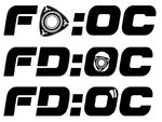

Chris_Ward
Active member
- Joined
- Jan 12, 2018
- Messages
- 118
Controversial comment I guess, but do we want to use the rotor in the logo, especially as we have V8 and other engine conversions in the works from members? Maybe incorporate the logo with an image of the car itself?

- Joined
- Jan 7, 2018
- Messages
- 1,042
Controversial comment I guess, but do we want to use the rotor in the logo, especially as we have V8 and other engine conversions in the works from members? Maybe incorporate the logo with an image of the car itself?
That was my line of thinking too. Something related to the car rather than the rotor for exactly that reason
Satoshi-FD3
Well-known member
- Joined
- Jan 14, 2018
- Messages
- 510

- Joined
- Jan 7, 2018
- Messages
- 1,042
Ooh can’t speak for everybody but I quite like that. Would it be possible to add in maybe the curve on each end of the rear light and maybe even the entire outline shape of the rear light (if you see what I mean) or would that make it too busy?
Satoshi-FD3
Well-known member
- Joined
- Jan 14, 2018
- Messages
- 510
I think I know what you mean.... leave it with me 
Chris_Ward
Active member
- Joined
- Jan 12, 2018
- Messages
- 118
I don't claim to have good graphics skills, but another spin on the shape:





jdmr_neil
Well-known member
- Joined
- Jan 12, 2018
- Messages
- 2,041
I like that but as Jit said the curve of the rear arches and bubble roof would really seal the deal imo.Duly noted.. How about:
No offence to everyone but I'm just seeing the stock catalogue of car club logos here.
Don't get me wrong, it is easy to critise and I don't have an artistic or original bone in my body. I'm not saying the efforts are shit but there are some good people out there I'm sure we could do something slightly more original or stand out.
Don't get me wrong, it is easy to critise and I don't have an artistic or original bone in my body. I'm not saying the efforts are shit but there are some good people out there I'm sure we could do something slightly more original or stand out.
Satoshi-FD3
Well-known member
- Joined
- Jan 14, 2018
- Messages
- 510



Hmmm I’m not so sure TBH. What would my idea look like?
JagKing - have you any ideas for what should be on it at all?
As I said, I'm not artistic/original at all. And what I said wasn't a "you're all shit I could do better" post, it's just my opinion that the logo is meant to make the club stand out/apart and sp far all of those have made me think of other brands or clubs so far. So for me it'd have to be something that doesn't look like every other car related company / club. AKA no side on silhouette, no just plain text, even the rear with lights has been done - although it is my favorite so far. and I agree your comment about having the rear quarter shape come down and enclose the FDOC text would make it look better.
One thing I'd say about MRC is, although looking dated and it doesn't exactly jump out at you, their logo doesn't make me think of another club. A bit of a revamp and that could be a better logo - think how Microsoft's Windows logo has pretty much stayed the same but evolved to not look as old as it is.
As I said, it's easy for me to say this shit with no real ideas of how to achieve it and I'm not trying to be awkward, just giving my perspective of what I see, feel free ignore and tell me to FDOC off.


Online statistics
- Members online
- 1
- Guests online
- 1,555
- Total visitors
- 1,556
Totals may include hidden visitors.


